
How To Learn TailwindCSS The Fast and Easy Way!
Skip the memorization, build UIs with confidence


What is TailwindCSS?

TailwindCSS is a utility-first CSS framework designed to help developers rapidly build modern websites without writing a lot of custom CSS.
Unlike traditional frameworks that provide pre-styled components like buttons or forms, Tailwind offers a collection of low-level utility classes for various styling aspects like layout, colors, spacing, and typography.
You directly add these classes to your HTML elements to achieve the desired styling. It’s as simple as adding a class name to your HTML elements, the difference is you don’t have to spend time writing styles. Each class name represents some pre-written styles and all you have to do is chunk those class names into your HTML.
The code snippet below shows a the use of some tailwind classes and the styles they apply:
<section class="flex items-center justify-center">
</section>
//flex - display: flex
//items-center - align-items: center
//justify-center - justify-content: center
One of the most difficult and annoying things about writing CSS in my opinion is having to come up with class names, but as you can see from the above code snippet, you don’t have to worry about that anymore. Styling has never been this easy!
At this point you’re probably saying to yourself “I get get it, but there must be some disadvantages to using TailwindCSS. It can’t all be good”. I hate to admit it, but TailwindCSS do have some disadvantages. Not to worry though, the disadvantages are nothing compared to the benefits. In fact I wouldn’t call them disadvantages, just some things you have to consider.
Below are the benefits of using TailwindCSS and somethings you have to put into consideration:
Benefits:
Faster development: With readily available utility classes, you can style your website quickly without writing extensive custom CSS.
Customization: You have granular control over the look and feel of your website by combining and modifying various utility classes.
Responsiveness built-in: Tailwind includes classes for responsive design, making it easy to create layouts that adapt to different screen sizes.
Clean HTML: Since styles are applied through classes, your HTML code remains clean and focused on structure.
Considerations:
Learning curve: Understanding the extensive collection of utility classes and how to use them effectively can take some time.
Verbosity: Overusing utility classes can lead to verbose HTML code, potentially impacting readability.
Less control compared to custom CSS: While customizable, Tailwind offers less fine-grained control over styles compared to writing pure CSS.
One of the considerations above is the learning curve, understanding the extensive collection of utility classes and how to use them effectively can take some time, but that’s the essence of this blog post — to teach you how to use TailwindCSS without having to learn all tailwind classes.
Now that we understand what TailwindCSS is and the power it possess, let’s dive into learning TailwindCSS the fasta and easy way.
The Easy Way to Learn TailwindCSS
In this guide, we’ll explore an effective way to learn Tailwind CSS, focusing on understanding core concepts rather than memorizing every class. While hours-long tutorials showcasing every class exist, this approach prioritizes practical application and long-term knowledge retention.
Here’s why traditional methods might not be optimal:
Information overload: Extensive lists of classes can be overwhelming and difficult to remember in their entirety.
Repetitive reference: Frequent revisiting of lengthy tutorials disrupts workflow and hinders independent practice.
Instead, let’s leverage your existing CSS knowledge:
Building on a foundation: By recognizing similarities between Tailwind classes and CSS properties, you can grasp concepts more quickly.
Focus on principles: Understanding the underlying logic behind utility classes empowers you to adapt and create tailored solutions, fostering long-term proficiency.
This guide will equip you with:
Essential Tailwind concepts: Learn about utility classes, variants, responsiveness, and customization.
Practical usage: Apply your knowledge through hands-on examples, solidifying your understanding.
Independent learning: Develop strategies for efficient exploration of the Tailwind documentation and extension.
Essential TailwindCSS Concepts
Utility Classes:
The core building blocks of Tailwind CSS are utility classes. Like we’ve discussed before utility classes represents individual CSS properties like margin, padding, color, font-size, etc.
Utility classes come in various values, allowing for granular control over specific aspects of an element’s style (e.g., m-2 for margin of 2 units, text-xl for extra-large text).
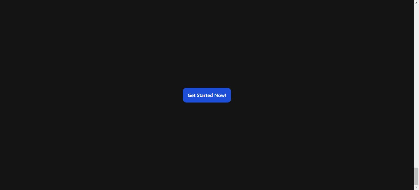
Examples: text-red-500 (sets text color to red with a specific opacity), bg-gray-200 (sets background color to light gray), flex (enables flexbox layout). The code snippet below shows a button with some utility classes :
<button className="px-4 py-3 bg-blue-700 text-white font-medium rounded-xl">
  Get Started Now!
</button>

Let’s break down the various classes used in this example:
px-4: This class adds horizontal padding of 4 units (e.g., pixels, rems, or ems) to the button element, creating space between the text and the button's edges.py-3: This class adds vertical padding of 3 units to the button element, creating space between the text and the top and bottom edges.bg-blue-700: This class sets the background color of the button to a specific shade of blue defined in the Tailwind theme (likely a dark blue).text-white: This class sets the text color of the button to white, ensuring good contrast against the dark blue background.font-medium: This class applies a font weight of "medium" to the button text, making it slightly bolder than the default font weight.rounded-xl: This class adds a large border radius to the button, giving it rounded corners.
Variants:
Variants are modifiers applied to utility classes to adjust their behavior under different conditions.
Examples:
Responsive variants:
sm,md,lg,xl- target specific screen sizes (e.g.,text-xl md:text-2xlsets text size to "extra large" on medium screens and above).Hover and focus variants:
hover:,focus:- apply styles when an element is hovered or focused (e.g.,button hover:bg-blue-700changes button background to a darker blue on hover).
The code snippet below shows a button whose background color changes when hovered on and it size shrinks in mobile screen:
<button className="px-3 py-2 lg:px-4 lg:py-3 bg-blue-700 hover:bg-purple-500 focus:border-2 border-white text-white font-medium rounded-xl">
  Get Started Now!
</button>
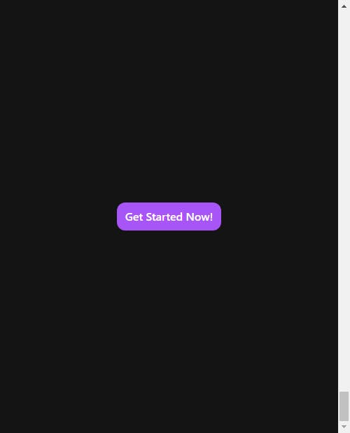
Let’s break down the classes used in this example:
px-3: Adds horizontal padding of 3 units (e.g., pixels, rems, or ems) to the button, providing space between the text and the edges.py-2: Adds vertical padding of 2 units to the button, creating space between the text and the top and bottom edges.bg-blue-700: Sets the background color to a specific shade of blue defined in the Tailwind theme (likely a dark blue).text-white: Sets the text color to white, ensuring good contrast against the dark blue background.font-medium: Applies a font weight of "medium" to the button text, making it slightly bolder than the default.rounded-xl: Adds a large border radius to the button, giving it rounded corners.
Interactive styles(hover and focus varinats):
hover:bg-purple-500: This applies a hover effect. When the user hovers over the button, the background color changes to a specific shade of purple defined in the Tailwind theme (likely a lighter purple).focus:border-2 border-white: This applies a focus effect. When the user focuses on the button (e.g., by clicking on it or tabbing to it), a white border with a width of 2 units appears around the button.
Responsive adjustments (responsive variants):
lg:px-4: This class applies the horizontal padding of 4 units only on larger screens (likely from the "lg" breakpoint and above). This allows for adjusting the button's padding for different screen sizes, potentially improving its layout on wider devices.lg:py-3: Similar to the previous class, this applies the vertical padding of 3 units only on larger screens.
Responsiveness:
Responsivenes is built-in with TailwindCSS through responsive variants, making it easy to create layouts that adapt to different screen sizes.
You can achieve responsiveness by applying utility classes with screen size prefixes (e.g., container mx-auto md:px-4 lg:px-8 creates a centered container with different padding on various screen sizes).
This has already been demonstrated in the previous example.
Customization:
TailwindCSS allows you to customize various aspects to fit your project’s specific needs.
You can adjust the default theme (colors, fonts, etc.) through configuration files.
Create custom utility classes using Tailwind’s plugins for specific design patterns or reusable styles.
Now that you’ve seen how easy it is to style elements with TailwindCSS utility classes and how similar the utility classes are to the corresponding CSS properties let’s learn how to master the various TailwindCSS utility classes.
Mastering Utility Classes
How do you master the vast amount of classes? By using thedocs!
You don’t have to memorize all the TailwindCSS classes, the TailwindCSS docs and TailwindCSS IntelliSense extension eliminates the need for that.
TailwindCSS Documentaion
Comprehensive explanations: The official Tailwind CSS documentation provides detailed explanations for each utility class, including its purpose, usage examples, and available variants. This allows you to understand the underlying concepts behind each class and how it affects the element’s style.
Search functionality: While the Tailwind documentation provides detailed explanations for every class, there’s an even faster way to find the right one for your needs: search directly within the docs! This eliminates the need to memorize vast amounts of classes, allowing you to focus on applying the perfect styles for your project efficiently.
Examples and code snippets: The documentation includes code snippets and examples showcasing how to use various classes in different scenarios. This provides practical guidance and helps you solidify your understanding of how Tailwind works in real-world applications.
TailwindCSS Intellisense Extension
Autocompletion: As you type class names in your code editor, IntelliSense suggests relevant Tailwind classes based on what you’ve already typed. This helps you discover new classes and explore various options without needing to refer to the documentation constantly.
Hover previews: When you hover over a Tailwind class in your code, IntelliSense often displays a preview of the generated CSS that the class translates to. This provides instant visual feedback on how the class will affect the element’s appearance.
Linting: Some IntelliSense extensions offer linting features that point out potential errors or inconsistencies in your Tailwind usage. This helps you write cleaner and more consistent code.
By leveraging both the extensive documentation and intelligent features of IntelliSense, you can:
Grasp the core concepts of Tailwind classes instead of solely memorizing names.
Explore different options efficiently and find the right classes for your needs without extensive searching.
Write code faster and more accurately with autocompletion and linting functionality.
This approach promotes:
Reduced learning burden: The similarity between class names and CSS properties fosters intuitive understanding.
Streamlined workflow: Searching the documentation directly saves time and effort compared to memorizing extensive lists.
Enhanced efficiency: Quickly find the styles you need and apply them directly to your code, accelerating your development process.
However, it’s important to remember that while these tools can significantly ease the learning curve and reduce the need for rote memorization, you don’t become an expert immediately. Continuously practicing and experimenting with different classes will ultimately solidify your knowledge and mastery of the framework.
Thanks for reading!
If you found this helpful in anyway do give me a follow and subscribe to my newsletter to see more educative posts like this in future.